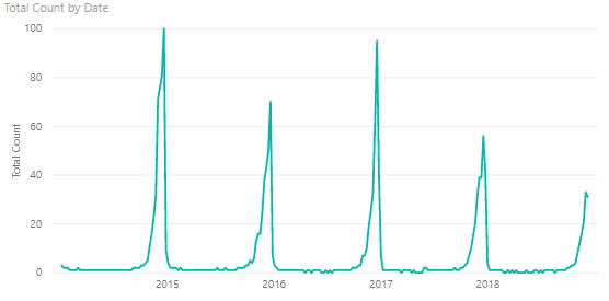
I saw an article last month by someone at the Washington Post doing some analysis of Google Trends data for "All I Want for Christmas is You" (AIWFCIY) by Mariah Carey (link). In it, he showed a year-on-year overlay of the trend for each year (showing a large spike around Christmas, of course). It gave me an idea for a post to explain how to use a relative time axis to compare patterns. This approach can be used to compare patterns from a shared fixed date (like the first of the year in the above example), or relative to an event for each item (e.g., product promotion/launch, project kickoff).
For starters, I pulled the same data from Google Trends showing the normalized count per week from 2004 to today, and made a line chart.

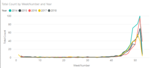
The simplest way to compare trends is to use your Date table. I made a DAX Date table and a relationship to the AIWFCIY data, which includes calculated columns for both Month and Week of the Year. Using Week (of the year) on the x-axis (and Year as the legend) gives the plot below, and we can compare the trends.
In the above example, the comparison is made relative to the same date (January 1st), but it is possible to compare the trends relative to different starting values. For this example, I pulled weekly movie data from Box Office Mojo from 2016 to Today. I will write a short supplemental post to show how to do that with a function to get the data for each Week-Year pair over that period. I wrote a measure to give the ticket sales for each of the top 10 movies over the three-year period and plotted it over time to give the following plot.
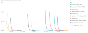
The measure returns blank() if the movie isn't one of the top 10 movies, to simplify the plot. That expression is shown below, but the same result could be obtained in several others ways too (e.g., slicers, visual filter).
Total Sales if Top 10 =
VAR movierank =
RANKX ( ALL ( Movies[Title] ), CALCULATE ( [Total Sales], ALL ( 'Date' ) ) )
RETURN
IF ( movierank <= 10, [Total Sales], BLANK () )
As you might expect, the first weekend is the highest followed by a sharp drop off in the following weeks. In your data model, you might have a product or project table with key event dates (e.g., product launch, promotion start, project kickoff/milestone). To simulate that in this example, I created a DAX table the shows the "Release Date" for each movie (i.e., the date for which sales are first reported), along with the "Total Sales" and "Best Week Ever" (sales for highest week). The expression for that DAX table is shown below:
Releases =
ADDCOLUMNS (
VALUES ( Movies[Title] ),
"ReleaseDate", CALCULATE ( MIN ( Movies[Date] ) ),
"Total Sales", [Total Sales],
"Best Week Ever", CALCULATE ( MAX ( Movies[Weekend Gross] ) )
)
Note: The "Total Sales" added column uses a measure and the implicit Calculate() that comes with it, ensuring that only the total sales for movie title on the current row of iteration on the Values(Movies[Title]) table is calculated. I did not write a measure for the other two columns, so they need to be wrapped in a Calculate() to get the correct result.
With a relationship between the new table and the Movies table (Box Office Mojo data), I then made a calculated column on the Movies table to calculate the weeks since release date. To normalize the y-axis, I also added a column to calculate the relative sales (compared to total sales for that movie). Both expressions are shown below. In both cases, since the new DAX "Releases" table is on the "1" side of the relationship, the Related() function returns a single value.
Relative Week Number = DATEDIFF ( RELATED ( Releases[ReleaseDate] ), Movies[Date], WEEK ) + 1
Pct of Total = Movies[Weekend Gross] / RELATED ( Releases[Total Sales] )
Since these are calculated columns, the value for the current row for Movies[Date] and Movies[Weekend Gross] is used without aggregation. When the two new columns are used in a line chart with movie titles as the legend, we can now compare the trend for each movie following release.
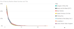
This dataset turned out to be very boring (i.e., first week is the best for all movies followed by a similar sharp drop off), but hopefully this approach will be helpful to you when comparing trends within your (more interesting) data.


Interesting post thanks for sharing. I'm not able to click to zoom in on any of the images though, not sure if you are able to attach them in a different way. Thanks!
Thank you for your comment. I was able to zoom in on them with Ctrl-Scroll, although they are not the highest resolution. Let me know which one you'd like to see closer and I can send a better image to you (or the pbix file).
Pat has been a tremendous help to our team at United Way of Central Indiana. His knowledge of PBI has really helped us streamline our data integration and analysis processes. The team is like sponges, absorbing all the shared wisdom from the master. Thanks Pat.
Thank you for your kind words, Lucy. Your team has been great to work with.
Great post thank you! I look foward to future posts.